A website’s design plays a crucial role in engaging users and conveying your brand. With so many sites competing for attention, having a polished, professional design is essential. Here are some tips to take your web design to the next level.
Choose an Appealing Color Scheme
Color has a significant impact on the overall look and feel of a website. When selecting colors, consider the type of site you have, your target audience, and the image you want to project.
- Use color psychology to elicit desired emotions. For example, blues and greens promote trust and security, while reds convey excitement.
- Limit your palette to 2-3 colors to avoid overwhelming users. Accent with neutrals like black, white and gray.
- Check that color combinations provide sufficient contrast for easy readability.
- Use color coding to organize and distinguish elements like navigation menus or CTAs.
- Test your palette across devices to ensure colors appear as intended. The wrong shades can look off on mobile.
Choosing a harmonious, meaningful color scheme gives your site visual appeal and helps shape user perceptions.
Prioritize Visual Hierarchy
A strong visual hierarchy guides users through your content in order of importance. Design elements should compete for attention based on what you want viewers to notice first.
- Make key content like headlines and calls-to-action prominent with size, color, contrast, space and placement.
- Use declining font sizes, lighter colors and narrower spaces for sub-headers, body text and supplementary info.
- Break up long sections with subheads, bullet points and white space for better scannability.
- Position navigation menus, search bars and branding where users expect to find them.
A purposeful visual hierarchy directs focus and makes complex pages feel simple and organized.
Select the Right Fonts
Typography significantly impacts aesthetics and usability. When picking fonts, aim for maximum clarity and alignment with your brand identity.
- Limit your selections to 2-3 fonts from the same general style for cohesion.
- Use clear, easy to read fonts like sans serifs for lots of text. Serifs work better for headlines.
- Avoid overly thin or decorative fonts that could impede legibility, especially at smaller sizes.
- Make sure fonts render smoothly across devices and operating systems.
- Use font pairing tools to find combinations that work well together.
Strategic typography makes your content easy to consume while expressing your brand’s personality.
Use White Space Effectively
Also known as negative space, white space refers to empty areas around elements, margins and padding. Properly leveraging white space does wonders for cleanliness and organization.
- Ease congestion and direct focus by framing key items with generous whitespace.
- Add breathing room between paragraphs, columns, menus and sections to prevent a cluttered feel.
- Set paragraph and line spacing to improve readability and reduce visual density.
- Limit width for long sections of text to avoid straining users’ eyes.
- Leave whitespace around page borders for a neat, contained look.
White space brings order, highlights importance and gives visitors visual relief on busy pages.
Optimize Images and Media
Imagery and media allow you to communicate messages vividly, show off products and reinforce branding. For best results:
- Compress files to improve load times while preserving quality.
- Size images appropriately so they don’t take up entire screens on mobile.
- Fill blank space with relevant lifestyle photos and infographics.
- Add captions to clarify intent and improve SEO.
- Let ample whitespace surround media items so they get the attention they merit.
- Ensure images have licenses allowing commercial use.
A balanced mix of high-quality visual content engages visitors and brings your pages to life.
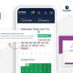
Craft Mobile-Friendly Layouts
With Google prioritizing mobile-friendly sites and mobile usage outpacing desktop, responsive web design is a must.
- Use a flexible grid system that realigns and resizes elements as needed.
- Size tap targets generously to aid touch navigation.
- Limit horizontal scrolling which frustrates mobile users.
- Choose fonts and visuals legible at smaller dimensions.
- Simplify menus and navigation for quick access on the go.
- Test across devices to identify and correct mobile UX flaws.
Designing for mobility ensures your site meets the demands of modern web use and delivers a consistent experience.
Check and Recheck Responsiveness
It’s not enough to just build your website with responsive frameworks and elements. You need to thoroughly test responsiveness across the spectrum of devices visitors may use.
- Audit desktop, tablet and mobile displays for each page.
- Resize browser to different widths to reveal breaking points.
- Try landscape and portrait orientations for mobile.
- Test using actual devices if possible.
- Identify issues with stacking, overlaps, truncation, readability and tap targets.
- Confirm forms and CTAs function properly.
- Assess speed over cellular and wi-fi connections.
Responsive web design needs ongoing quality assurance to address flaws before they impact user engagement.
Elevating your website’s design requires carefully weighing aesthetics, branding, usability and responsiveness. By focusing on key areas like color, hierarchy, typography, whitespace and mobile optimization, you can craft engaging experiences that effectively communicate to your audience. With users expecting sites to work flawlessly on all devices, ensuring an adaptive, glitch-free responsive design is essential.CopyRetry